
Check three values right now: your live power output in kilowatts (kW), your cumulative energy total for the day in kilowatt-hours (kWh), and whether electricity is flowing to or from the grid. Those three numbers tell you whether your system is working, how much it has produced, and whether you are exporting surplus or drawing from the grid. Reading solar generation data properly takes under a minute once you know what to look for.
- Check live power (kW): Open your inverter app or look at your generation meter. On a clear day at midday, a healthy 4 kWp system should show 2–3.5 kW or more. Zero at noon means something is wrong.
- Check daily total (kWh): This is your running energy tally since sunrise. Compare it to yesterday’s figure and to the same date last month.
- Note the export/import arrow: An arrow or positive figure pointing toward the grid means surplus is being exported. An arrow pointing inward means you are drawing from the grid.
- Confirm your monitoring type: Does your system measure production only, or does it also track household consumption via CT clamps? If it is production-only, your app will not show a consumption figure, and any “self-consumption” calculation will be an estimate.
For metric definitions, go straight to the next section. For troubleshooting a zero or low reading, jump to the spotting-problems section. For reporting or warranty checks, the historical-data section explains which dataset to use.
Key takeaways
Reading solar generation data correctly means checking live kW, daily kWh, and export/import flow together, then using historical metered data for any formal performance claim or warranty dispute.
| Point | Details |
|---|---|
| Three immediate checks | Live kW at noon, daily kWh total, and export/import direction tell you system health in under a minute. |
| Spot a probable fault | Zero output at noon on a clear day, or a step-change in monthly totals, warrants a screenshot and an installer call. |
| Use historical data for claims | Archive-quality metered readings, not real-time app estimates, are the right basis for warranty or performance disputes. |
| Batteries change the numbers | A battery reduces visible export figures; lower export is not a fault but a sign the system is self-consuming more. |
| Increase self-consumption | Shift high-load appliances to peak solar hours and consider an immersion diverter to absorb surplus before it exports. |
Before calling your installer, record screenshots, timestamps, monthly totals, and the inverter serial number. Smarthometechnical covers Dorset, Hampshire, and Devon for diagnostics and servicing.
Table of Contents
- What do kW, kWh, and the other solar metrics actually mean?
- How to read your UK smart meter and generation meter
- How to interpret your monitoring app’s graphs and dashboards
- What output should you expect from a typical UK system?
- How to spot under-performance and what to check before calling your installer
- When should you use historical data for reporting or warranty claims?
- How batteries and export tariffs change what the numbers mean
- An installer’s perspective on odd data and what to do about it
- Sources
What do kW, kWh, and the other solar metrics actually mean?
The single most common source of confusion in understanding solar data is mixing up kW and kWh. Think of kW as speed and kWh as distance. Your car’s speedometer reads 60 mph right now (kW), but the total miles driven today is 120 (kWh). Both matter, but they answer different questions.
Generation is the total electrical energy your panels have produced, measured in kWh. Consumption is what your home has actually used. Import is electricity drawn from the National Grid when your panels cannot cover demand. Export is surplus solar sent back to the grid. Self-consumption is the share of your generated energy used directly in your home rather than exported, expressed as a percentage.
A simple worked example: your 4 kWp system generates 20 kWh on a sunny July day. Your home uses 12 kWh. The remaining 8 kWh goes to the grid as export. Generation (20 kWh) = self-consumption (12 kWh) + export (8 kWh). That identity always holds.
Performance ratio is a slightly more advanced metric: it compares actual output to what the system would produce if it ran at nameplate efficiency under real irradiance conditions. For a domestic rooftop in the UK, a performance ratio within a typical range is common. Specific yield (kWh per kWp per year) is useful for comparing systems of different sizes; a south-facing 30° roof in southern England might achieve 900–1,100 kWh/kWp annually, while a north-facing or heavily shaded array will fall well short.
Many portals will not report consumption unless CT clamps or whole-home monitoring are installed. If your app shows generation but no consumption column, that is why.
How to read your UK smart meter and generation meter
Most UK solar installations include at least two meters: the smart meter fitted by your energy supplier, and a generation meter (sometimes called an export meter) installed alongside the inverter. They measure different things, and reading both gives you the full picture.
Reading your smart meter:
- Press the button on the face of the smart meter to cycle through the display screens.
- Look for the register labelled “IMP” (import, electricity drawn from the grid) and note the kWh figure.
- Look for the register labelled “EXP” (export, electricity sent to the grid) and note the kWh figure.
- Some SMETS2 meters display a live power reading in kW; this updates every few seconds and is useful for a quick sanity check.
- Record both figures with a timestamp. A simple note in your phone or a spreadsheet row works fine.
Understanding how smart meters work with solar panels in the UK is worth a few minutes of reading, because the export register on a standard smart meter measures net export, not gross generation. If your home uses some of what the panels produce simultaneously, that self-consumed energy never appears on the smart meter at all.
Reading a separate generation meter:
A dedicated generation meter (often a small grey box near the inverter or consumer unit) records gross generation regardless of what the home uses. The display cycles through screens; the cumulative kWh total is usually the first or second screen. Note the reading and the date.
Logging readings:
A spreadsheet with four columns (date, generation meter kWh, smart meter import kWh, smart meter export kWh) is all you need. Take a snapshot on the same day each month, ideally the first of the month at the same time of day. Survey evidence suggests that households who check their meters regularly are more likely to catch faults early and adjust behaviour to reduce grid imports.
Pro Tip: Check your live kW reading at solar noon on a clear day once a month. That single data point speeds up diagnosis significantly.
How to interpret your monitoring app’s graphs and dashboards
Most inverter manufacturers provide a companion app or web portal. The terminology varies, but the underlying structure is almost always the same: a live flow view, a daily power profile graph, and monthly or yearly totals.
Live flow or power-flow diagram: This is the animated tile showing arrows between solar panels, your home, the grid, and (if fitted) a battery. An arrow from panels to home means direct self-consumption. An arrow from panels to grid means export. An arrow from grid to home means import. Understanding the solar energy flow diagram in detail helps you read these tiles correctly, especially when a battery is in the loop.
Daily power profile graph: This is the most useful graph for spotting problems. A healthy south-facing system on a clear day produces a smooth bell curve peaking around solar noon. Clouds create dips and spikes. Shading from a chimney or tree produces a flat shoulder on one side of the curve. A completely flat top to the bell curve (called clipping) means the inverter has hit its maximum output limit, which is normal if the array is slightly oversized relative to the inverter.
Monthly and yearly views: Day-to-day variation is normal and largely meaningless on its own. Monthly totals smooth out weather noise and are far more useful for spotting a genuine performance decline.
Common app quirks to watch for:
- Time zone shifts: Some portals default to UTC rather than BST during summer, shifting the daily curve an hour to the right. The data is correct; the timestamp is not.
- Delayed or satellite-derived irradiance data: Some apps overlay a predicted generation line based on satellite weather data. This can lag real conditions by 15–30 minutes and should not be used to judge live performance.
- Missing consumption data: As noted above, if CT clamps are not installed, the consumption tile will either be absent or show zero. This is a monitoring limitation, not a system fault.
- Negative export figures: Occasionally appear after a firmware update or meter reconfiguration. Screenshot and report to your installer rather than ignoring.
What output should you expect from a typical UK system?
A 4 kWp rooftop system is a useful reference point because it is close to the UK average for domestic installations. On a clear midsummer day in southern England, such a system might generate 20–25 kWh. In midwinter, the same system might produce 2–4 kWh on a dull day, or closer to 8–10 kWh on a bright frosty one. Neither figure is a problem; both are normal.
Factors that affect output include roof orientation and tilt, shading from trees or neighbouring buildings, panel soiling, and inverter efficiency. A solar panel output factors checklist covers these in detail and is worth reviewing before concluding a system is underperforming.
| Season | Typical daily output for a 4 kWp, south-facing system in southern England |
|---|---|
| Winter | Lower daily output typical due to season |
| Spring / Autumn | Moderate daily output typical for these seasons |
| Summer | Higher daily output typical due to longer daylight and sunnier weather |
These are broad ranges. A north-facing array or one with significant shading will sit toward the lower end of each band. An unshaded south-west-facing array at 35° tilt in Dorset or Hampshire will often reach the upper end.
Pro Tip: Compare the same calendar month year-on-year rather than day-to-day. July this year versus July last year, using your logged monthly totals, is a far more reliable performance check than comparing Tuesday to Wednesday.
How to spot under-performance and what to check before calling your installer
Most performance problems announce themselves clearly if you know what to look for. Work through this sequence before picking up the phone.
Step 1: Check live output at solar noon on a clear day. If the reading is zero or implausibly low, note the exact time, the weather, and the figure shown.
Step 2: Check the inverter status light. Green typically means normal operation. Red or flashing amber usually indicates a fault code. Photograph the display.
Step 3: Look at the daily graph shape. A sudden step-change downward partway through the day, with no corresponding cloud cover, suggests a string fault or shading event. A gradual decline over weeks suggests soiling or a developing inverter issue.
The Solar Data Tools onboarding pipeline demonstrates how plotting heatmaps of time-series data makes these step-changes immediately visible, even in large datasets.
Step 5: Check for data anomalies. Missing samples (gaps in the graph), time shifts (the curve appears offset by an hour), or repeated identical readings can indicate a communication fault rather than a generation fault. These are different problems with different fixes.
Before you call your installer, record:
- Screenshots of the daily graph and live flow tile, with timestamps
- The inverter model, serial number, and firmware version (usually in the app’s device settings)
- The date the problem started or was first noticed
- Your monthly totals for the past three months
Probable causes mapped to symptoms:
- Zero output at noon on a clear day: inverter fault, AC isolation trip, or grid disconnection
- Reduced output on one side of the daily curve: shading from a new obstruction or a string fault
- Gradual output decline over months: panel soiling, degradation, or a developing inverter issue
- Consumption showing zero despite the home being occupied: CT clamp fault or misconfiguration
Pro Tip: Never attempt to access rooftop panels, junction boxes, or inverter DC wiring yourself. DC circuits in a solar system carry voltage even when the inverter is switched off. If you suspect a rooftop fault, stop at the data and call a qualified installer.
When should you use historical data for reporting or warranty claims?
Not all solar data is equally reliable, and using the wrong dataset for a formal claim can undermine your case. Solargis Monitor documentation defines four data maturity groups, each suited to different purposes.
| Data type | Update cycle | Best use |
|---|---|---|
| Nowcast | Every 5–15 minutes | Immediate operational awareness; not for formal reporting |
| Real-time | Every 10–15 minutes | Short-term operational monitoring; useful for live fault-spotting |
| Operational | Daily recalculation for recent days | Short-term performance reporting; reasonable for weekly summaries |
| Historical (archive) | Released monthly | Formal reporting, warranty claims, benchmarking |
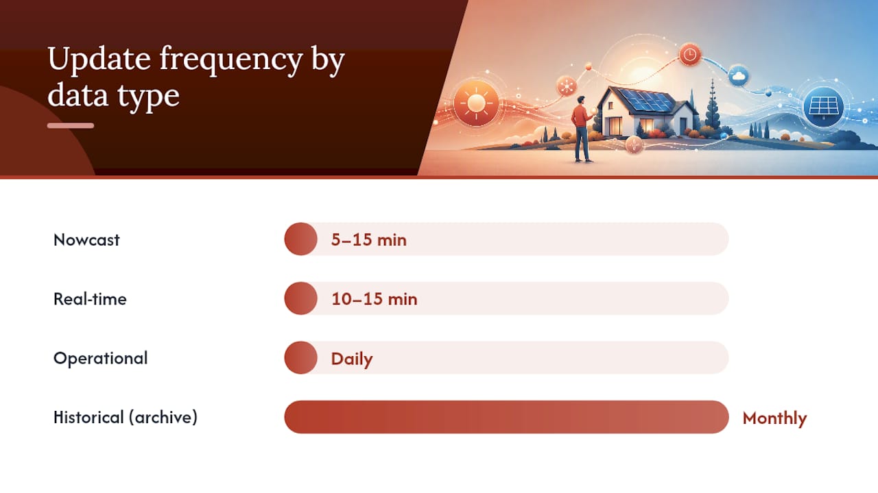
For a warranty claim or a dispute with your installer, always use historical (archive) data. Real-time figures can contain communication gaps or preliminary values that are later revised. Berkeley Lab’s user guide illustrates this well at utility scale: the preferred column for analysis is gen_clean, which is bias-corrected or post-curtailment, rather than raw modelled generation. The same principle applies at domestic scale: use your meter’s cumulative kWh readings (which are legally metered figures) rather than app estimates when making a formal claim.
Producing a one-page performance summary for an installer or warranty claim:
- Export monthly generation totals from your app for the past 12 months (most portals have a CSV export option).
- Add your generation meter readings for the same period from your log.
- Note any months where the two figures diverge significantly, as this can indicate a metering or communication fault.
- Include a screenshot of the daily graph for the day the problem was first noticed.
- State your system’s rated capacity (kWp), installation date, inverter model, and panel model.
How batteries and export tariffs change what the numbers mean
Adding a battery to a solar system changes every flow in the diagram, and it changes what the numbers in your app actually represent.
Without a battery, the flow is simple: panels generate, home uses what it can, surplus goes to the grid. With a battery, generation charges the battery first (or simultaneously), the battery discharges to the home when panels are not producing, and only genuine surplus after both home and battery are satisfied goes to the grid. Your app’s export figure will therefore be lower with a battery, even if generation is identical. That is not a fault; it is the system working correctly. For more on how this plays out financially, the hybrid solar battery system guide covers the Hampshire context in detail.
Export tariffs and the Smart Export Guarantee: Under the Smart Export Guarantee, licensed electricity suppliers with more than 150,000 customers must offer a tariff for exported renewable electricity from small-scale generators. The rate varies by supplier and tariff. Whether it makes more financial sense to export or to store and self-consume depends on the gap between your export rate and your import rate. With Ofgem’s energy price cap setting the ceiling on what suppliers can charge for imports, the arithmetic shifts regularly. When import prices are high relative to export rates, self-consumption is usually more valuable than exporting.
Practical actions to increase self-consumption:
- Set your dishwasher, washing machine, and tumble dryer to run during peak solar hours (roughly 10 AM–3 PM in summer).
- If you have an EV, schedule charging to coincide with peak generation rather than overnight grid import.
- Use a hot water immersion diverter (such as those compatible with GivEnergy or similar systems) to absorb surplus solar into your hot water cylinder before it exports.
- Review your time-of-use (TOU) tariff settings if you have a battery: many systems can be configured to charge from the grid at cheap overnight rates and discharge during expensive evening peak periods, stacking savings on top of solar self-consumption.
An installer’s perspective on odd data and what to do about it
The most common call we receive at Smarthometechnical goes something like this: “My app says I generated nothing yesterday, but it was sunny.” Nine times out of ten, the generation was real; the communication between the inverter and the monitoring portal dropped overnight. The inverter’s own display will show the correct daily total even when the app does not. That is the first thing to check.
The second most common issue is a homeowner comparing their output to a neighbour’s and concluding their system is underperforming. Roof orientation, shading, and system size make direct comparisons almost meaningless without normalising for those variables. A 3.6 kWp east-west split array will never match a 4 kWp south-facing array on a summer day, and it should not be expected to.
When a homeowner contacts us with a suspected fault, the information that speeds up diagnosis most is: a screenshot of the daily graph for the problem day, the inverter’s fault code or status light colour, and the monthly totals for the past three months. With those three things, we can usually identify whether the issue is a communication fault (fixable remotely), an inverter fault (requires a site visit), or a data interpretation issue (fixable with a five-minute call).
If your system is showing persistent zero readings, a step-change in monthly output, or fault codes you cannot clear, the right move is a professional diagnostic visit. Smarthometechnical offers solar installation diagnostics and servicing across Dorset, Hampshire, and Devon. Bring your screenshots, your monthly log, and the inverter serial number, and we can usually identify the cause within the first visit.
Sources
- Monitor data interpretation (Solargis Knowledge Base)
- Solar Data Tools tutorial — getting started
- User guide for utility-scale solar generation and market value data file (Berkeley Lab)
- Smart Export Guarantee (SEG) – earn money for exporting the renewable electricity you have generated
- Energy price cap explained (Ofgem)
- How to read your solar monitoring app: a beginner’s guide (SolarBasicsHub)
Recommended
- How solar reduces your household bills: a homeowner’s guide – Smart Home Technical Ltd
- What is solar panel wattage: a homeowner’s guide – Smart Home Technical Ltd
- Why switch to solar energy: a 2026 homeowner’s guide – Smart Home Technical Ltd
- Solar in Hampshire retrofits: a homeowner’s guide – Smart Home Technical Ltd
